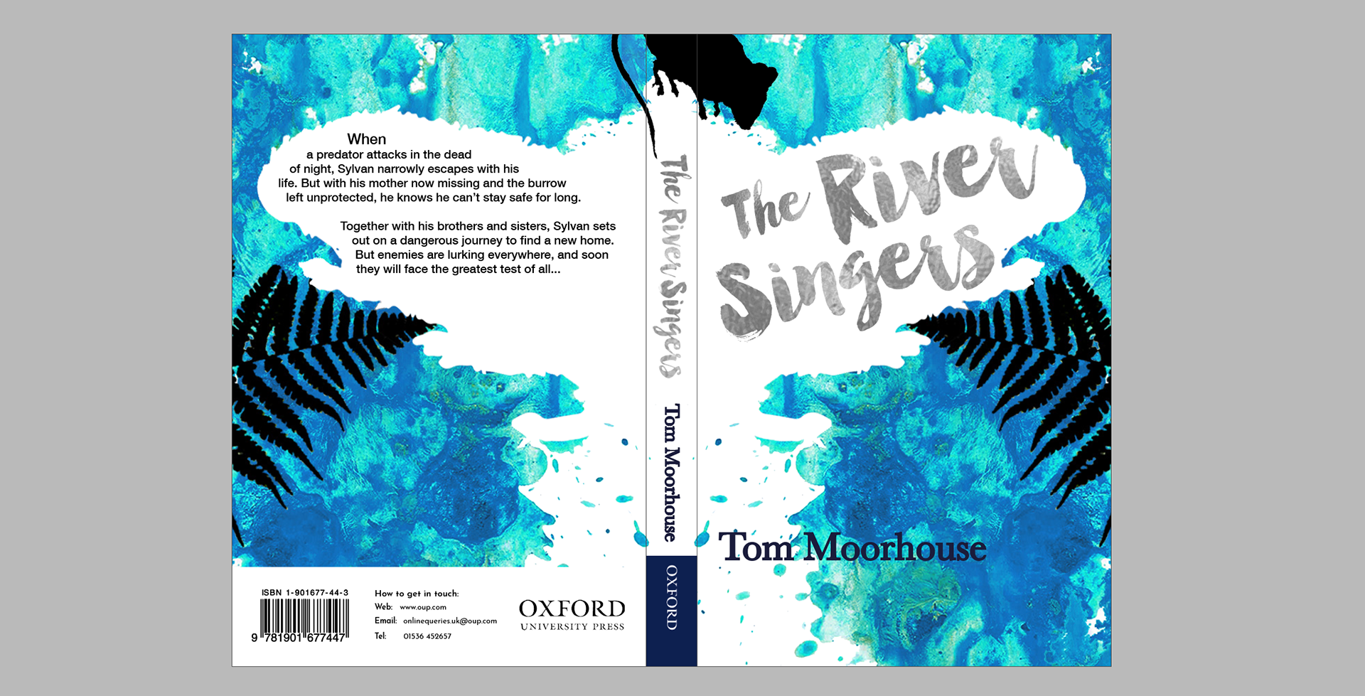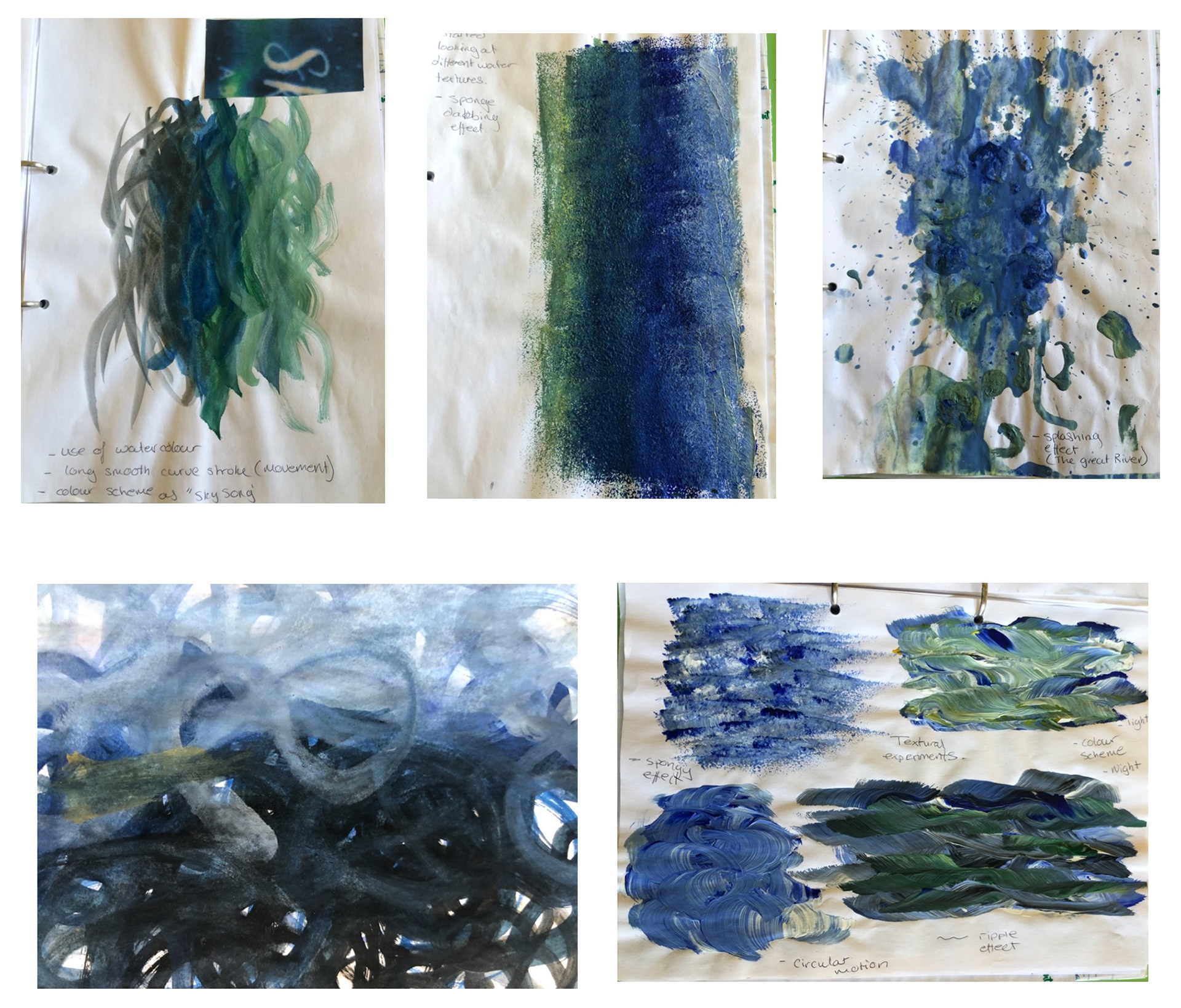
I experimented with different textures to represent the movement of the water; sponge, swirl, circular, rippled and splash effect. All of these strokes were created with a sponge, painting brush and water. Depth can easily be generated with movement to which the brush/sponge is directing towards. It can also be created with different shades of colour.
The level of typographic element needs to be improved in order for it to stand out.
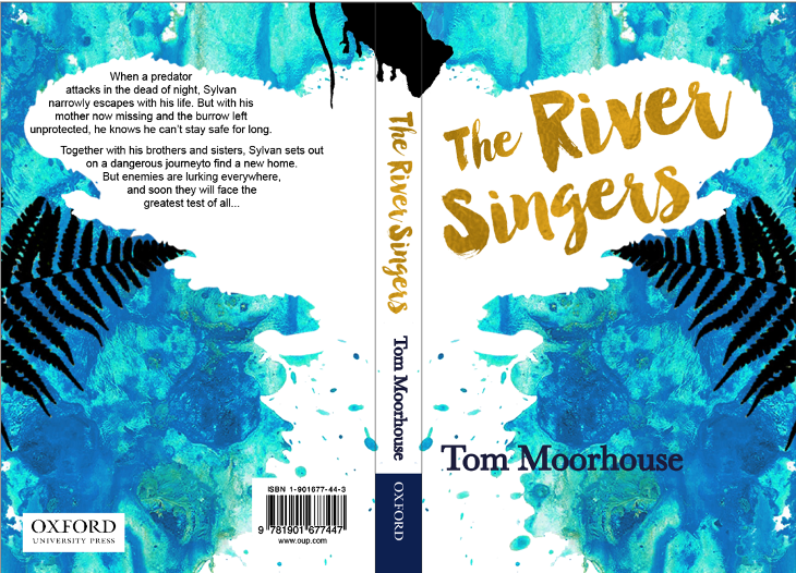
The colouring is fine, nice contrast between the black images and the blue/green background. The textures are engaging, however, the typography is fighting against the images not work with.
A heavier weight in text may solve the problem, since a foil may be used as a print finish over the top.
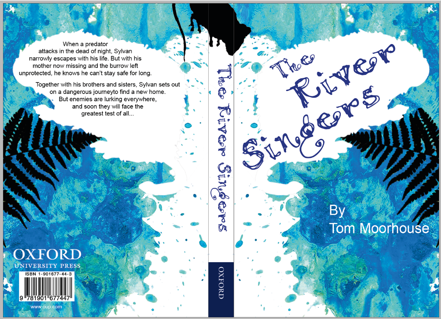
Typographic elements are starting to come out, still don’t stand out enough in terms of colour.
Colour and typeface for the author doesn’t sit right with the rest of the design. Looking back at examples online at amazon and WHSmith the author titles have a bit of a more serious tone i.e. introducing serif type.
Remove some of the spots in the background by the title to make it more legible.
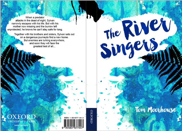
Gold foil typeface brings out the extra effect, I don’t think it contradicts with the other textures in the design.
Place a boarder under the OUP logo as it lacks legibility.
Think about positioning of the author title, use the space.
Final Book Cover
For the print finishes I have decided to have a silver foil over the title of the book, front page and spine. The shiny foil will be very effective in standing out from the rest of the books in the store as the shininess will catch the eye.
For the second print finish I have decided to have a spot vanish over the blue textured background, leaving the white bit plain, so you get the contrast of textures between the two. The spot vanish will also be on the splashes of blue on both front and back of the cover.
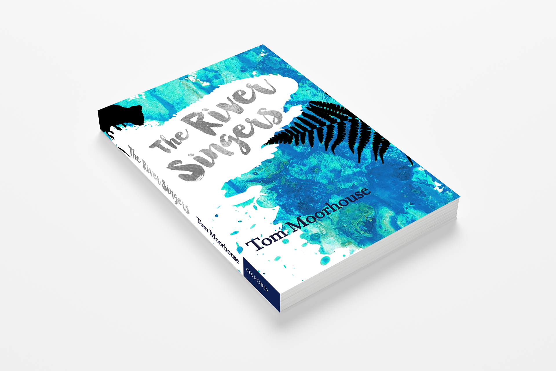
The salience and texture of the title (Manhattan Darling) is much stronger. Stands out much more.
Change the gold foil to silver as it will complement the rest of the design more effectively.
Left a line the blurb to out outline of the River Singer’s shape. It will look more professionally done than been done manually.
Change the formatting of the first line or word of the blurb, so it stands out drawing the attention in from the reader.
Change the barcode and the logo around, the logo needs breathing space, so the box can go. Extra information needs to be added to the back for example, email address, telephone no. and URL. Looking at other books for this age group, some have banners going across if the background is detailed a textured. More professional.