Title too long and doesn't grab attention of reader well enough.


The client suggested adding some color into the background and we experimented with this. The client preferred the purple background as long as all the logos could be seen.
We were slightly worried about having the watermark in the background as it could decrease the legibility of the title. However, we made it really faint so the text would stand out and we would still achieve some graphic detail. It also connected quite well with the business card building on the brand identity. This made the flyer more interesting as it stands. We felt it was also important to have the logo at the top also as that would be the second thing the viewer would look at. The image used added some warm tones, which felt welcoming, it was also one of the stock images the client most preferred. The purple connects the the flyer with the leaflet also building the brand identity. We felt the purple also made the supporting logos of ABC to read to stand out along with the text.


The more successful designs to develop further are design 4, 6, and 7.
Standardise the symbols you are using for the contact details, consider whether you need these symbols at all? (I think perhaps you don't)
Create larger margins, the text in all designs is running too close to the edges of the card
The registered charity is on design 4 and 6, do you need this on the card? Is it part of the logo? If it is, I question whether it is needed.
Feedback based on design 2:
I think this is the most effect layout for the business cards. The others do not feel resolved enough.
So, suggest sending this one without the watermark (this is not working very well, and placement of it is awkward).
You could show this one in different colourways if you want to give options to the client e.g., name in purple/name in blue.
Consider line breaks on materials like this.
So, here I would take over the word 'Development' so that 'Development Officer' is on one line
Suggest using colour a bit more strategicially, i.e., to indicate hierarchy.So, here perhaps have the name and title in a colour and the contact information in black.
The order of information is odd. Consider how you are grouping information.
Here I would suggest:
postal address
telephone numer
email address
website
postal address
telephone numer
email address
website
Or
tel no.
email
webiste
postal address
webiste
postal address
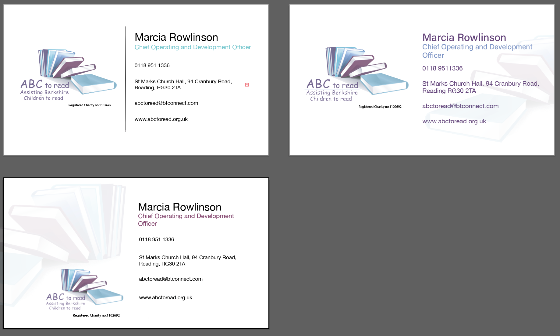
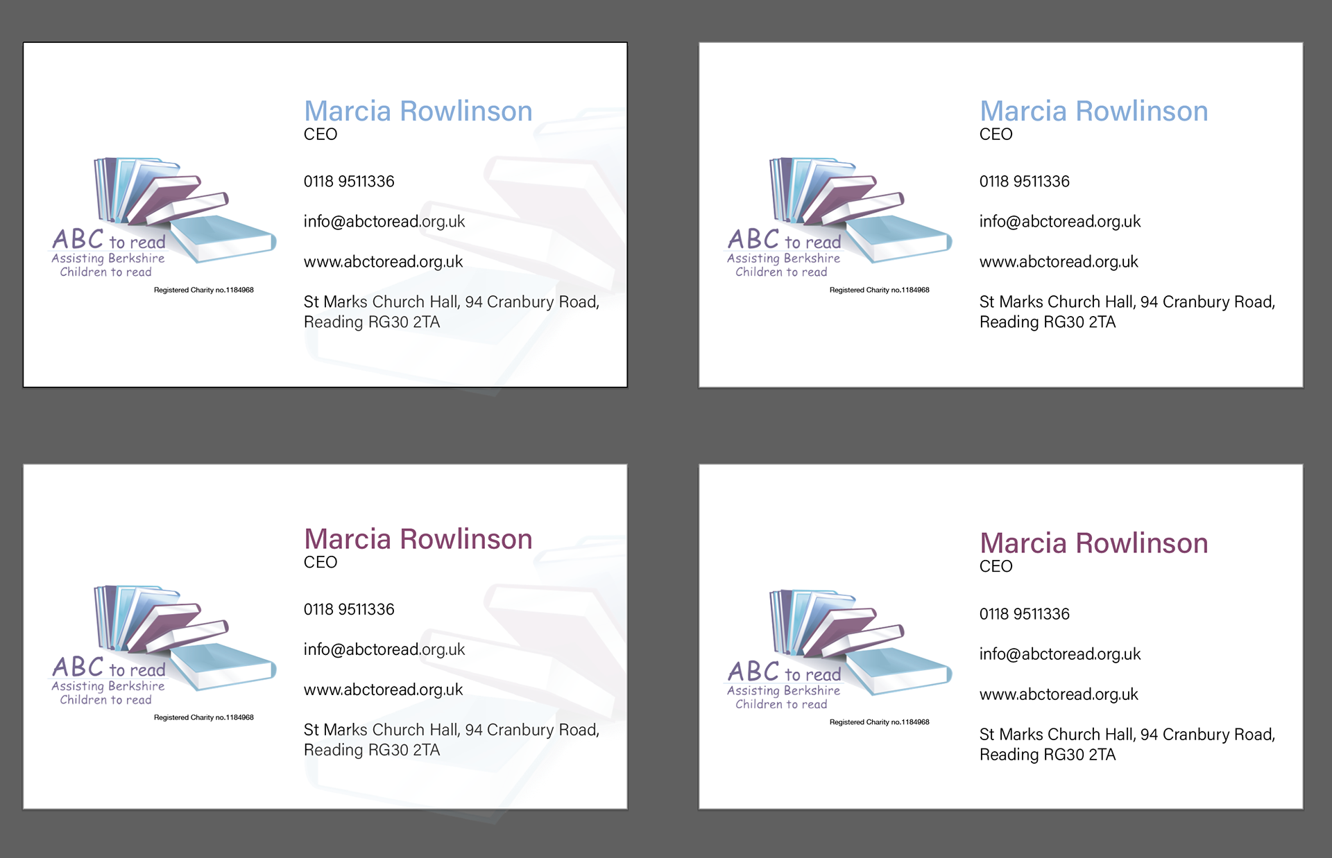
We quite liked the watermark, so we have provided options for the client. We have completed different variations showing different title colours with both watermark and no watermark.
The client was pleased with these final designs and we have been confirmed by the client that the business card has been approved by the board.