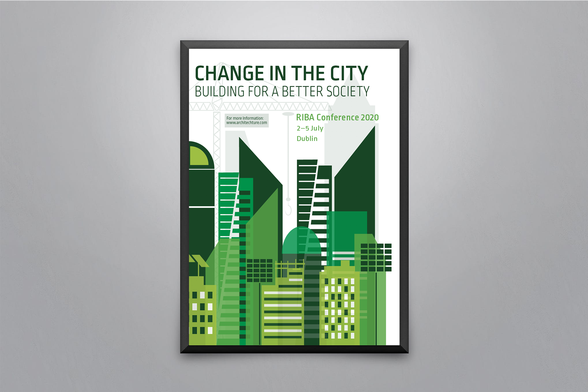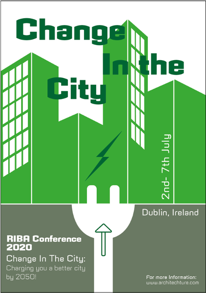
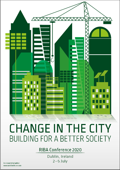
Make the title bigger, it is not legible with the buildings in the background. Maybe decrease the opacity of the buildings or change the colour of the text.
Incorporate the text within the poster, looks slapped on.
More work needed, on the text at the bottom of the poster, it is currently making life harder for the viewer with the date hidden in the illustrations.
Move assets arounds, the poster currently very central, play around with dimensions.
Greater sense of depth by including layering and shading.
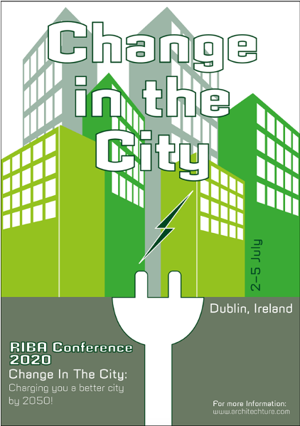
Placing all the relevant text together adopting hierarchy techniques, makes all the information easy to allocate and understand.
Incorporating the text with the illustration unifies the poster.
The concept is very well communicated.
I believe this poster pinpoints at least 5 of Ellen Lupton’s, points to how posters work.
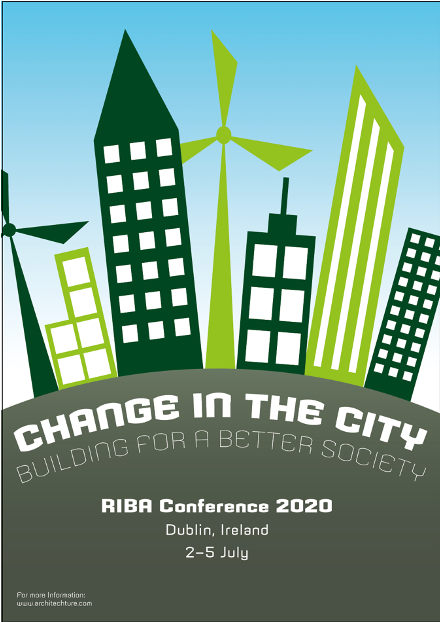
This design wasn’t very strong, it lacked illustrative definition, it just looked like a less well-done version from the inspirations I took above.
This design was much better in terms of definition. The globe was taking up too much space. The colours tie everything together but the buildings and the globe look very separate due to the shadowing at the bottom. Thing that is missing is space, removing the globe and concentrating on the building would generate that space. It is quite a simple design, so the text around the corner and make it feel quite claustrophobic. Change the typeface so that it relates more with the image for example, sharp and tall. It would definitely add more interest if the letterforms matched shapes of the buildings.
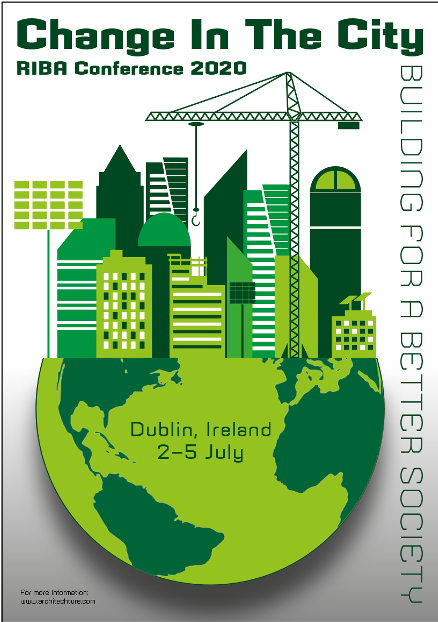
This design I really struggled with the dynamic aspect of text and image. It all looked too proper and way too formal, so I just decided to expand the image and leave it hanging off the page. This generated lots more space.
It stands out, lot of illustrative detail.
The concept is very clear “building for a better society”
The green is bright, and the contrast between the different shades is very eye catching.
Typographic elements are very clear and corresponds well with the image.
Going back to Ellen Lupton’s book – how do posters work. This poster I feel has taken 6 subsections towards a successful poster.
- Focus the eye
- Overwhelm the eye
- Overlap
- Make eye contact
- Tells a story of what could happen
- Manipulates scale